Interactive Website Redesign
Interactive Website Redesign

A Fresh Start for Interactive
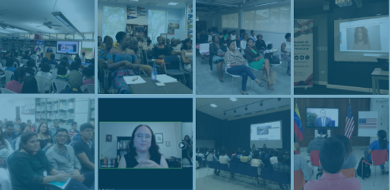
The Interactive team at U.S. Department of State conducts live stream programs on topics of international importance, such as agripreneurship, STEM, and press freedom. While the team is cutting edge in its video services, its website needed some work to better reflect Interactive's technical prowess.
Task: Re-design the Interactive website, including new features and capabilities. Build a working prototype to be used for testing and handoff to developers.
Solution: Utilize the content from the old website but start fresh on the look and information architecture. Expand the website's page layouts for the team to better showcase their work.
Main Role: Project Lead
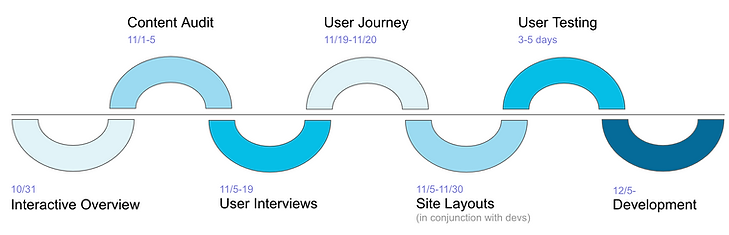
Timeframe: Three months
Methods/Tools: Agile method, user journey maps, wireframes, WebAIM, UXPin
Deliverables: High-fidelity prototype
As this project was my first introduction to the Interactive team, I took the time to meet with two team representatives to gain a better perspective of their work and their wants and needs for the new website. We met bi-weekly as the project began to keep decisions mutual and moving forward. Anyone working in a large office setting can attest that being a few floors apart can feel cities aways. So when not meeting in person, we used a Slack channel in the interim to keep communications open; the whole team was free to ask questions as they arose, and I would provide progress updates to keep everyone in the know.
User Research
For Interactive programs, the audience is U.S. embassies, consulates, and American Centers abroad. Thankfully, the team representatives were very helpful in connecting me with staff at approximately 15 different locations worldwide. Otherwise, this could have been a very difficult task of identifying the users on my own. I intentionally chose to speak with staff from a variety of regions and with different job roles. It was fascinating listening to global users' use of the Interactive programs, how they host viewing parties for the live streams, how they promote the programs, and what pain points they were experiencing. Overall, the users were very happy with the live streams. It was clear that the Interactive team took great care and effort in their programming. That said, much of that success was due to the dedicated team, not the website. In fact, only two of the nine users I spoke with had seen the Interactive website.
While users lived across the globe, there were some commonalities in their habits of Interactive programs and what they needed to enhance their live stream experiences:
-
The majority of users were unaware of the Interactive website
-
Instruction and tips for hosting viewing parties weren't easily accessible
-
Users relied on the Interactive newsletter or word of mouth from colleagues to learn about upcoming programs
-
Program updates were sometimes sent too late to be useful (especially when waiting for translations)

Site Design + Branding
Based on the personality of the Interactive team's programmatic objectives, it was important to me to keep a fresh, advanced look to their website. Several constraints had to be considered when designing, including keeping page layouts within approximately the same parameters of the Young Africa Leaders Initiative (YALI) website. In fact, if you visit both sites, you will be able to recognize the similar content blocks and layouts. Other than that, we gave Interactive's website a very distinct sub-branding, separate from YALI's but still within the overall design system of U.S. Department of State.


Usability Testing
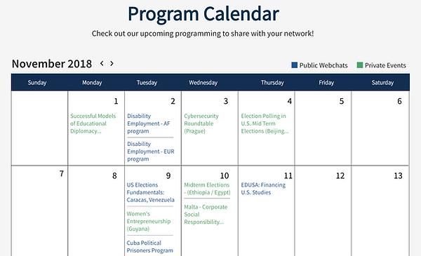
I spoke with several of the original testers plus some new contacts to test the usability of my high-fidelity mockups on UXPin. Giving test prompts, I observed users complete a variety of tasks to see how easy or difficult it was to navigate the new site layout. An example of a design challenge identified by early testers was confusion over public versus private events on the event calendar. Originally, I had put the explanation of blue versus green titles at the bottom left of the calendar, but users weren't finding this legend easily. I moved it to the top right of the calendar and all subsequent testers said it was clear when asked if they understood the difference between the green and blue titles.
Being a truly agile approach, I worked with our team's web developers with the original mockups and throughout the user testing phase. We kept each other updated on a Jira board so I knew where they were in the process of coding the website, and they knew what parts of the mockups I was still testing and adjusting. It was so helpful to organize our tasks on a project board and work in sprints to keep our goals manageable.
Takeaways
This was my first project as the sole UX designer, but I was only one part of the whole process. Having supportive stakeholders, engaged users, and understanding developers makes the designs great, not the designer alone.