Interactive Website Redesign
Interactive Website Redesign

A New Information Architecture for ihcities
ihcities is a growing startup in DC, and quickly becoming the trusted travel resource to those seeking a one-stop solution for trip planning. With such a depth of options for things to do within DC, we helped the company clearly structure their website so users could find exactly what they wanted to do while visiting.
Task: Re-design the existing ihcities website, focusing on simplifying its information and emphasizing its service approach. Build a working prototype to be used for testing and for demonstration.
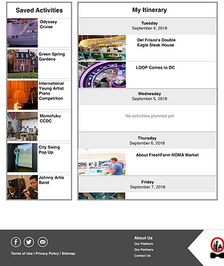
Solution: Give the website a clear, direct navigation and layout that will be accessible and comprehensible to all travelers. In line with ihcities’ goal to achieve a seamless travel experience, the site will feature an itinerary building and travel personalization options.
Main Roles: Project Manager | Scrum Master | Researcher | Brand Design
Timeframe: Three weeks
Methods/Tools: Agile method, Empathy and Affinity Mapping, Moscow method, wireframes, Sketch, Atomic
Deliverables: Usability Testing, high-fidelity prototype, brand value proposition
The Process
Once we had a clear vision of the client’s needs, our team of three created a project timeline, assessed the UX strategies we would need to use to achieve the client’s goals, and agreed upon methods of communication and documents sharing. We met each morning to scrum, discussing our previous day’s accomplishments and the day’s goals.
User Research
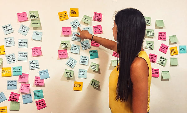
While we already had a product to test, we wanted to make sure we were truly meeting the needs of the users. Therefore, we conducted ten user interviews to ensure we were solving their pain points. Our client cared deeply to make ihcities an accessible product for everyone, so we created an encompassing screener survey that targeted all who had traveled in the last six months and that had planned at least part of the trip’s activities. Target users were then contacted for a follow-on interview. Using affinity and empathy mapping, we discovered the following insights:
-
Pain points included logistical arrangements, organizing group trips, and being overwhelmed with the research and planning process
-
There was a mix of methods for itinerary building, including printing from webpages, copy and pasting into a Word document, writing notes on their phone, and emailing themselves the information
-
Users typically looked at multiple sites (including local blogs) for planning a trip
Market Analysis
In order to provide users a greater experience in trip planning, we researched travel websites and their core features. We noticed that many informational features were staples to the sites, but that most competitors did not take service design into strong consideration, particularly in the areas of personalized itinerary building and meeting accessibility needs. We took these two features into account during our product re-design.

Usability Testing
Another key part of our background research was conducting usability testing on the current ihcities website. Our eight users were highly impressed with the content of the website, but found confusion in the organization of the homepage’s categories.
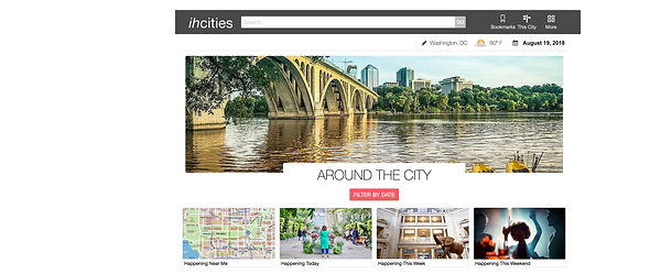
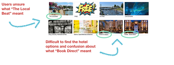
Using an Agile approach, we continually tested our design throughout the creation process. Through A/B testing and card sorting, we were able to organize the great depth of information currently living on the website. From the feedback we received, we ensured that accessibility was met by increasing contrast between icons and text with the background images.

Prototype
It was important to us to keep the personality of ihcities and its parent company it’shospitality. In our re-design, we remained within the company’s branding scope, and made adjustments based on the areas users did not feel connected with the product. This includes adding two additional “softer” colors to the site to complement the original red which some users found “harsh” if used too often.

The Product
ihcities has a strong product that has the potential to revolutionize the existing travel experience in Washington, DC. My role was not to stand in their way but to help them help users understand the website’s potential. Through restructuring the current website and creating the feature of a personalized trip planner (one of their primary goals), my team was able to deliver a clean, comprehensive site that can be used by people of all ages and any location.

Takeaways
Sometimes, simple design is the toughest challenge of all. This product has so much to give to users, it was a humbling experience to get to assist in organizing the information architecture for them.
